
Share This

Pretty Posts
Creativity is a word that we often use when we are talking about innovations, because an innovation is the product of creativity. It can be the result of a single brain thinking outside the box or a team of people who are completely making the future happen. When we see a new design, we are always expecting a movie that we haven’t already watched. Why would we want to buy a ticket for a movie that we have already watched in another cinema?
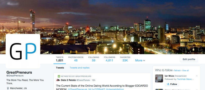
Twitter has released its new design for everyone, so now, if you are a Twitter user, you can switch to their new design. Saying they have killed creativity is probably not completely true. The fact that they haven’t used any of the creativity that their almost 3,000 employees posses is really what matters. The design introduced by Twitter is something we have already seen more than once and in particular from Facebook’s profile.
The company has just translated Facebook’s design and adapted it to Twitter’s needs. Have they built a successful product? No, they have made the overall experience more complex by not seeing that Twitter was born to be simple, otherwise Jack Dorsey would have chosen 600 hundred characters, instead of 140. Twitter’s new profile design follows the same pattern as Facebook’s one, with a large cover picture on top, the profile picture on the left and all the additional data below the this photo.
They have tried to put a focus on tweets. With this choice, the text looks bigger and users are more likely to notice them. However if I am on Twitter, it’s because I want to read those tweets in any case, so making them bigger can just annoy me, instead of building more interactions. Further, you can now see the number of favorites tweets on top of the page, a useless feature that the company has ignored for almost ten years.
Twitter’s profile is more suitable for brands that are on the service to promote something, a tv show, a product or even a website; but this layout is not really suitable for a single individual who’s simply on the service to enjoy the experience. We don’t need to be bigger, we want to be small as Twitter was supposed to be. That’s why minimalism should have been what they had to look for. We are considering a service that was originally based for sms (that’s why they chose 140 characters), so why would you want to make it stand out with a greater layout?
If I was a complete stranger, without any knowledge about Twitter and Facebook, I would have probably said that these two designs come from the same hand. The reality is that the companies don’t share the same team of designers. Although this is my humble opinion who could find hundreds of supporters on the internet, we always have to keep in mind Twitter’s situation. This company is on the public market now and they really don’t want to do big mistakes at the moment.
They simply have to focus on two things, user growth and revenues. If they have changed the design in this way, it’s because it improves these two aspects. Before choosing it, the company has probably gone through several different iterations and tests, which have given as a winner the option they chose in the end.
Even though this choice could be beneficial to Twitter, I don’t think the design of a service should be adapted to the company’s needs. The public image of Twitter is what the company is about. Think about Google and the way they have designed their homepage. If they were thinking about revenues, they would have placed ads all over the page (as their competition was doing), but in the end, they didn’t do it and they won the race.



Pingback: Is A Design Team More Important Than What Your Users Think?